PROJECT OVERVIEW
THE PRODUCT
Baked! is a dedicated mobile app that is focused on helping small business owners and bakers setup an eCommerce page, promote and conduct their business safely through the app, streamline order fulfillment and connect with customers.
PROJECT DURATION
June 2024 - July 2024
-
Many local bakers who are small business owners are having a difficult time keeping up with the corporate-owned bakeries with a larger scale business reach. While setting up an online shop through social media sounds like a great idea, receiving orders, marketing and finding customers is tough.
-
Baked!’s goal is to help local bakers/small business owner manage their business online through a streamlined process that includes marketing and order processing. It also hopes to bridge customers and local bakers/small business owners, so that customers can find high-quality baked goods while also supporting the local economy.
-
For this project, I am both the UX designer and UX researcher.
-
My main responsibility is to create an app design that is vibrant, fun and easy to use for both business owners and customers.
UNDERSTANDING THE USER
My research consisted of user surveys from both customers and small business owners. I conducted my research by sending surveys via email.
USER JOURNEY MAP
This user journey illustrates how a customer can go through the process of searching for bakers and ordering products online.
STARTING THE DESIGN
SITEMAP
This sitemap for Baked! specifically follows the mobile app’s route on the customer-facing side.
Paper wireframes
(mobile only)
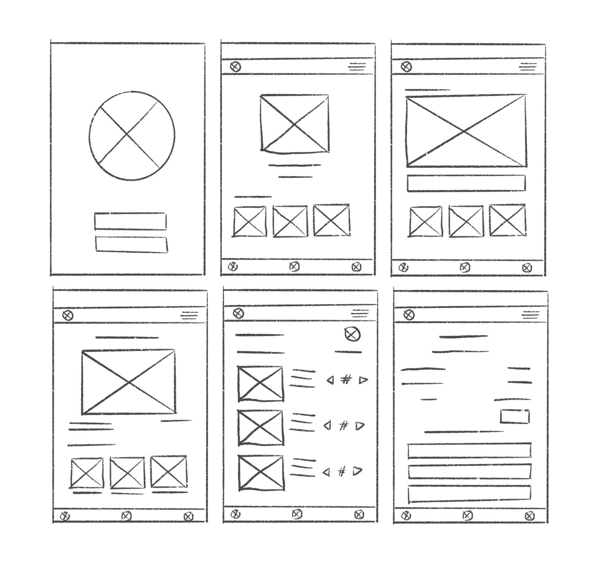
The paper wireframes featured the login page, the Find a Baker page and the order process. This version shows the app meeting its main function: which is to help bakery owners set up an eCommerce page and to help customers find them.
DIGITAL WIREFRAMES AND LOW-FIDELITY PROTOTYPE
These digital wireframes illustrate the most basic function of the app, based on the initial paper wireframes. In one frame, there is a map placeholder plus a list of bakers within the area all in one screen. In another frame, there is a full menu display during the order process for easy ordering.
USABILITY STUDIES
Study Type: Unmoderated usability studY
PARTICIPANTS: 5 participants
Location: United States, Remote
LENGTH: 20-30 minutes
REFINING THE DESIGN
MOCKUP: BEFORE AND AFTER
Two columns for the menu items instead of three made the design less busy and easier to read. I also simplified the bottom navigation to feature Search and Back buttons. The hamburger menu and the profile icon were switched to follow a more traditional flow. I also added more space between items and icons.
MOCKUP: ORIGINAL SCREEN SIZE (MOBILE ONLY)
VISUAL DESIGN ELEMENTS
〰️
VISUAL DESIGN ELEMENTS 〰️
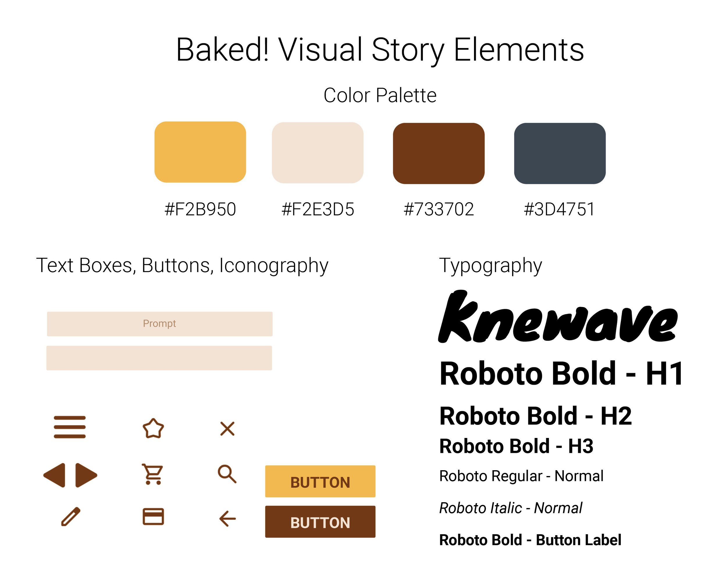
The visual elements of this brand had two aims: vibrancy and simplicity. A yellow monochromatic palette was chosen to emulate the color of happiness and baked goods. The buttons, typography and iconography chosen are simple yet universal and functional.
Accessibility considerations
1
While the chosen colors are almost monochromatic, I opted for the lightest and darkest colors in the spectrum for dramatic contrast to increase readability.
2
The text is large by default to not only compliment the simplistic design but to also also increase ease of reading.
TAKEAWAYS
IMPACT
Small business owners need to use digital tools in their arsenal to compete. Having a targeted app like Baked! that bridges eCommerce and ease-of-use can help people set up their own business without breaking bank on upkeep and completing administrative tasks. It also helps them easily find the customers who are looking to support their business.
WHAT I LEARNED
A single app can benefit different user types. In the case of Baked!, the business owner and the customer needs are both addressed.
NEXT STEPS
1
Add additional payment options for the payment process, save options for the delivery address and payment information for easy use in the future, and add detailed order progress tracking.
2
Conduct more usability studies from both business-owner and customer user types to learn what can be improved on the app.
3
Explore a web version of Baked! to address any limitations experienced by the users on the mobile app.
Credits: Stock images were pulled from Pexels and Canva.


