PROJECT OVERVIEW
THE PRODUCT
Skybrary is an award-winning eBook library that supports families and educators. While it is an eBook webapp, the product includes an educator’s dashboard for class rostering, tracking students’ reading activities, and curriculum resources.
PROJECT DURATION
February 2024 - August 2024
-
Skybrary has existed since 2016 but has yet to be updated since. The look, feel, and functionality are considered outdated, especially by many of its long-time users. Its branding also does not align with the branding guidelines of the nonprofit that runs the app.
The app has recently been integrated into Clever, which lets educators access different educational apps in a single sign-in. This means that some of its functionalities will also change.
-
Update Skybrary to align with the key functionalities that come with the Clever app integration and update the app’s look and feel to align with the nonprofit’s branding guidelines.
-
For this project, I am both the UX designer and UX researcher.
-
My primary responsibility is to create a sleek, simple design that adheres to the brand identity of Skybrary and the nonprofit organization that owns the app. The project wants to maintain the shape design of the dashboard but update colors, visual design elements, content and information architecture.
(wireframing, high-fidelity prototyping, visual design)
With this in mind, I also needed to address the pain points I gathered during my UX research and how to integrate the new dashboard with Clever’s capabilities.
(ux research, functionality)
UNDERSTANDING THE USER
My research consisted of user surveys and focus groups from Skybrary users. I conducted my research through Zoom meetings and sent surveys via email and through the official Skybrary website. I also gave an incentive to my participants.
USER JOURNEY MAP
Clever integration will mainly address user pain points such as signing in and rostering. However, there is still more work that needs to be done with the functionality and design in the other pages in order to make improvements in the user journey.
STARTING THE DESIGN
SITEMAP
This sitemap outlines the informational architecture of the Skybrary teacher dashboard using two different kinds of logins: Classic and Clever.
CLASSIC SKYBRARY
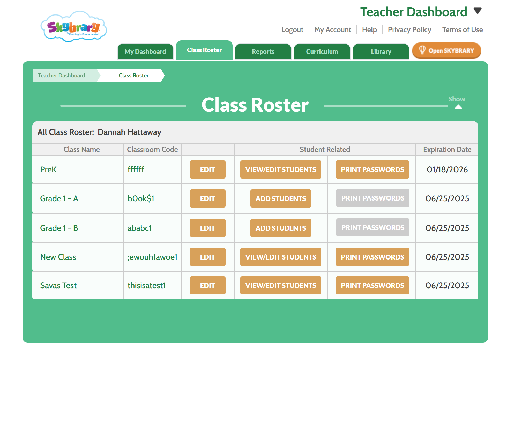
The classic Skybrary was initially designed in early 2016. Much of the colors and branding does not align with the branding guidelines of the organization that owns the app.
In addition, most of the content, IA, and functionality needed updating. For example, in the Class Roster tab, providing classroom codes and passwords to students will be removed. In the Library tab, the Sneak Peek button triggers an overlay modal that does not offer any new information about the book we don’t already see in the main Library section. The dropdown filters are also not user-friendly in this case, especially when there are so many options per dropdown.
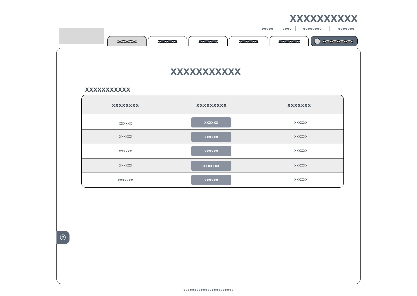
DIGITAL WIREFRAMES
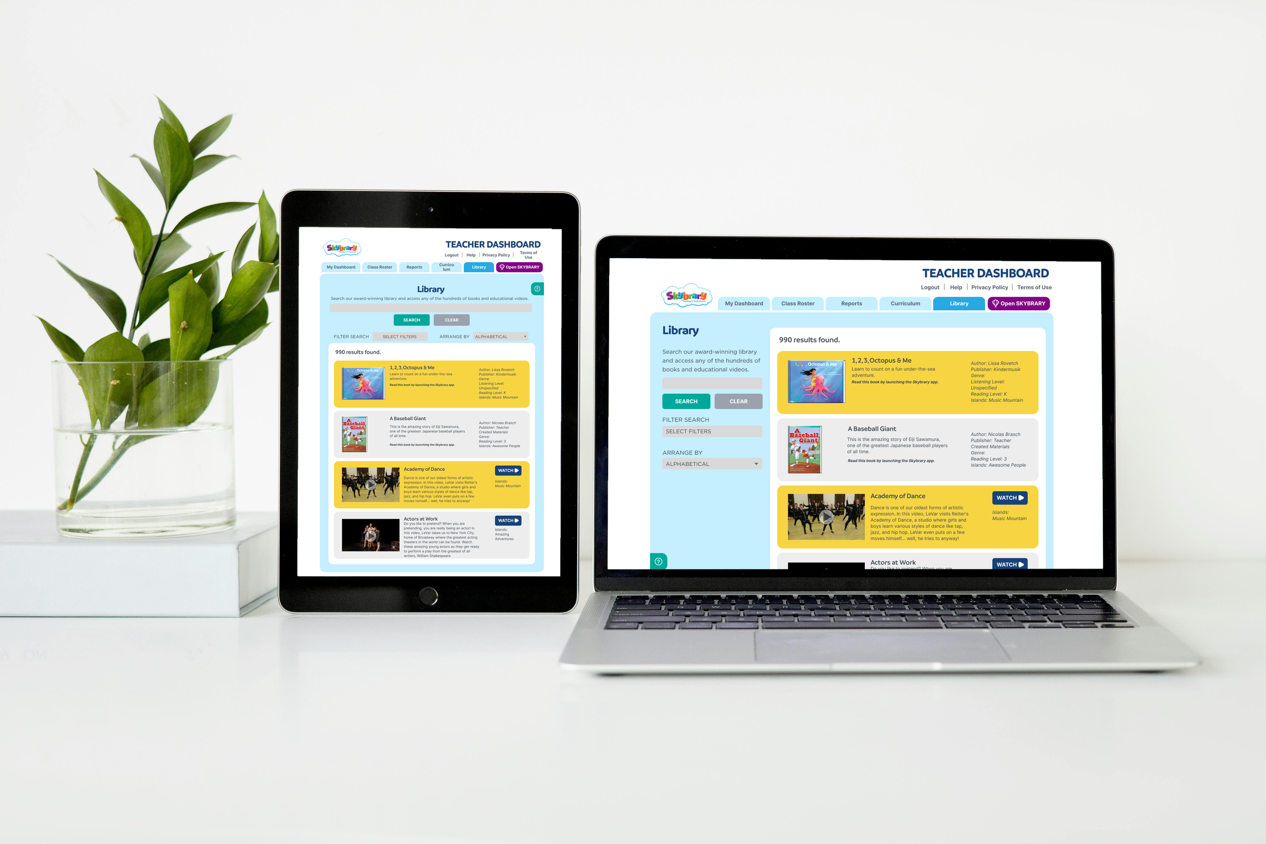
Skybrary dashboard was primarily designed for desktops and tablets, since most of its target users—educators—use large screen devices to access educational apps and tools.
This project stated that the classic version's current shape styles would be kept, but content, IA, and colors should be updated. Some of the unnecessary functionality in the dashboard should be removed, and sorting functions in any tab with a PII database should be added. In a way, I was trimming down the design to make it simple yet purposeful.
USABILITY STUDIES
REFINING THE DESIGN
MOCKUP: BEFORE AND AFTER
MOCKUP: DESKTOP VS TABLET
MOCKUP: CLEVER VS CLASSIC
VISUAL DESIGN ELEMENTS
〰️
VISUAL DESIGN ELEMENTS 〰️
Most visual design elements adhere to the nonprofit organization’s branding guidelines. The typography and colors have been pulled from that guideline. I removed the green and orange colors from the classic version, and replaced it with the brand’s colors to make sure that Skybrary is cohesive with the nonprofit organization. I also chose bright colors in contrast with dark colors from the palette to give it a more vibrant look.
Accessibility considerations
1
The chosen colors here come from the selected color palette from the organization's branding guidelines. The high contrast colors have been selected to help maintain usability with color blind users.
2
The navigation labels are clear, concise, and consistent. This allows for easy and intuitive dashboard navigation experience, which saves time for its users.
TAKEAWAYS
IMPACT
District administrators and teachers found the new dashboard easy to use. Class rostering did not consume time since Clever handled the rostering and the manual work has been entirely removed from the process. The class reports were clear, and creating lesson plans around specific books took less time. Each function within the dashboard served a purpose which helped the teachers use the app effectively in their work.
WHAT I LEARNED
Simplifying data is very important, especially to educators who already have a lot on their plate. By making the user experience clear and intuitive, educators are spending less time doing administrative work and more time on teaching and engaging with students.
NEXT STEPS
1
Connect with the users and receive their feedback on their experience with the current iteration of the dashboard.
2
Provide a preview function for the books in the Library tab without making the user leave the dashboard.
3
Conduct more usability studies to improve the functionality of the dashboard.


